

")
")

Choosing a colour palette for your branding can be quite overwhelming especially for non-designers. For small businesses and start-ups who are still in the discovery phase – my advice is to not get overwhelmed by keeping your branding simple. You probably have a lot going on and at this stage there is no need to build on to that stress.
But before you actually start thinking about your brand colours its important do some research and understand why you should choose certain colours over other. And it is but natural that we tend to veer towards our personal liking and choices but when it comes to your business you need to think about your customers, what they will like and not what you like personally. Yes, your personal taste can influence your choices but it should not overtake them.
So to generate colour palette for branding best is to begin with asking some questions to yourself about
Your Audience
- What sort of colours appeal to your ideal audience?
- Which other companies / businesses they follow on social media?
- What colour palette are these businesses using (earthy, neutral, bright, soft)
Understand Your Competition
Follow your competitors account on social media.
Check how are they branding themselves , what colour schemes are they using. It will help to be more creative and not repetitive.
- What types of colour palettes are they using? (feminine, bold, playful)
- Are there specific colours that reoccur among your competitors?
Look for Inspiration
Once you have done your research, you will have a better understanding of what type of colours appeal to your ideal audience and what is being used by your competitors. Now it’s time look for some inspiration.
Ask yourself
- What is your brand style? Is it classic or modern or more fun or professional?
- What different types of colours do you associate with various styles?
Once you have the clarity then it’s time to create some inspiration. And the best way to gather inspiration is by creating a moodboard with images on PINTEREST that represent your brand style and what you think your audience associate with daily life, work, family, style, emotions etc.
Now that you have your moodboard, look for common colours in the images that you can see. This should determine your dominant or main colour
For example – if you have ended up choosing many images with shades of green, then green can be the main colour of your brand.
BASICS OF A COLOUR WHEEL
Here we are going to understand the relationships between the primary, secondary and tertiary colours in a circle.
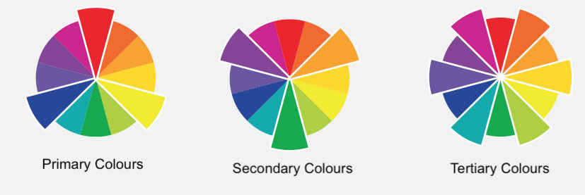
Red, blue and yellow are the primary colours, and they are the base of every other colour. They cannot be created by mixing other colours together.
Secondary colours result when two primary colours are mixed together; they include orange, green and purple.
Tertiary colours are created when a primary colour is mixed with a secondary colour. Examples of tertiary colours are blue-green, red-orange and yellow-green.
White and black are not technically colours, but they can be used to create lighter or darker (tints or shades) colours. For example, combining white and red makes pink, and blending black with orange makes brown.
COLOUR VARIATIONS
HUE: Hue is the actual colour or the basic family colour from red to violet . Hues are variations of a base colour on the colour wheel.

SHADE: A shade is created by adding black to a base colour, increasing its darkness. Shades appear more dramatic and rich.

TINT: A tint is created by adding white to a base colour, increasing its lightness. Tints look more pastel and less intense.

Temperatures: Colours are often divided in cool and warm tones according to how we perceive them. For example: Greens and blues are considered cool, whilst yellow and reds are warm.

At the initial stage you can just stick to simple principles
- Try a combination of warm and cool colours
- To have a contrast choose dark and light colours
- Add one colour that stands out, for example blue for things you want highlight.
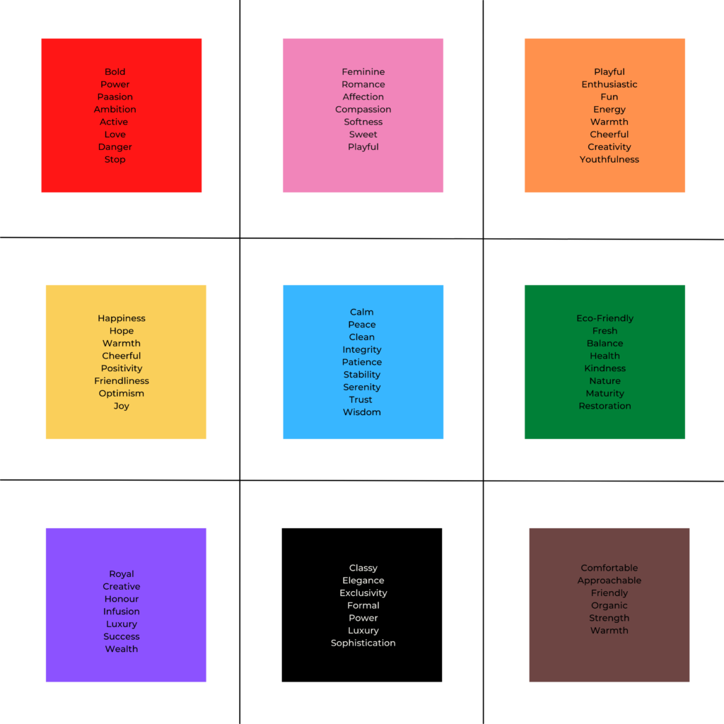
WHAT IS COLOUR PSYCHOLOGY?
It is key to understand that colours are an important consideration when working on your brand identity as colours have impact on people’s emotions. We usually respond to various colours based on their association with our life experiences or our culture. Colours can signify different meanings in different cultures.
In broader sense here is a generic association we make with colours
Now that the basic colour concepts are getting a bit clear in your head let’s see how we make associations of these principles
- Neutrals (low saturation) – SOFT, SIMPLE, CLASSY, MINIMAL

- Jewel tones (high saturation) – LUXURY, RICH, ELEGANT,

- Pastels (tints) – FEMININE, SOFT, CARING, CHILDISH

- Dark tones (shades) – SOPHISTICATED, SERIOUS, PROFESSIONAL

NOW ITS TIME TO CREATE YOUR COLOUR PALETTE
Now that you, have enough inspiration and guidance in understanding how a colour palette should be chosen you can take help of colour palette generators and get going!
Just remember to follow these guidelines as you do so –
- Maybe try to choose one or two similar colour shades that your competitors are using but do not replicate your competitors
- Add values to your palette, you need have a dark enough tone for the text on your website or blog.
- Also, add a shade or two of neutral tones.
- Finally follow your instinct! You can follow all the steps but also listen to your gut feeling- just keep in mind that your colours should appeal to your audience and should make your appear different from your competition.
Once you have created a colour palette for your brand, make sure to use it on all of your brand touch-points and do not use any other colours. This will allow you to showcase a consistent image of your brand and will help it stand-out for your audiences.
WANT TO START CREATING DESIGN 👩🏽🎨 ELEMENTS FOR YOUR BRAND
✨GET FREE CANVA PRO trial NOW!✨

[…] or create a “confused brand” website. A confused site uses variety of fonts, images, colour palettes which may not resonate with the actual message.This usually happens for variety of reasons a) Lack […]